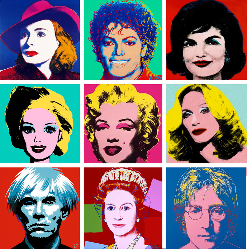
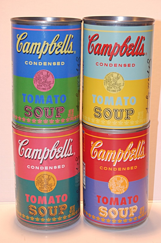
Pop ArtFor this project we'll be learning about a style of art called Pop Art. We'll see some well-known works of art and the artists that created them. Because color plays such a big role in Pop Art we'll also learn a bit about color schemes.
Videos: |
|
https://www.khanacademy.org/partner-content/tate/global-modernisms/global-pop/v/alan-cumming-on-pop-art
COLOR SCHEMES:
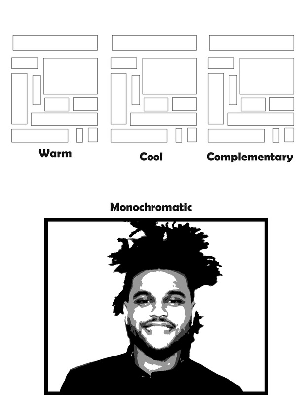
Color Schemes to know: Warm, Cool, Complementary, Monochromatic
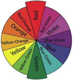
Color Scheme Worksheet
Good examples of lighting:

|

|

|

|

|

|
Video Examples:
Cutting out your subject
This video is almost exactly like what we did in class, except that he's placing his cutout on a new photo instead of a solid color background. He also goes into a lot of detail on how to make good selections of hair. You can skip it if it doesn't apply to your photo.
At the end of his video he chooses output to "new layer with layer mask." We clicked output to "NEW LAYER."
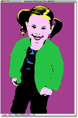
VidePosterizing and adding colors * I'm working on a newer video, please be patient.
When I made this video I taught this lesson a little differently, so you may see a couple new things, but it's basically the steps to make your picture look cartoonish. Then it shows how to do the Select>Color Range steps.
One thing that it doesn't show is how to MERGE LAYERS. Instead, I tell you to flatten your layers several times. Please skip that step, and instead do it like we did in class:
1. After you cut out your subject add these three layers - Black and White, Layers, and Posterize. Add in that order for best results.
2. Next we need to merge the three layers with the person's layer. To do this click the top layer (Posterize), hold down SHIFT, and then click the bottom layer (the one with your cutout person on it.) Then, right click on these layers and choose MERGE LAYERS.
3. After this you can continue with the Select>Color Range steps.
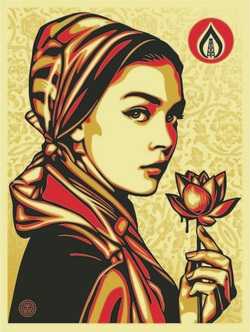
Shepard Fairey Style Poster:
Alternate Methods and Additional Tricks: An alternate style of Pop Art you may be interested in trying: www.photoshopessentials.com/photo-effects/pop-art/ |
|
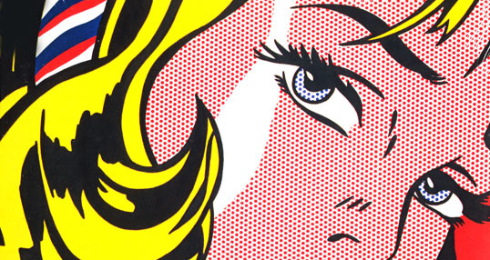
Ben-Day dots
I would suggest starting this video at about 2:30
I would suggest starting this video at about 2:30
Adding Ben-Day Dots like Roy Lichtenstein: http://www.melissaevans.com/tutorials/pop-art-inspired-by-lichtenstein_